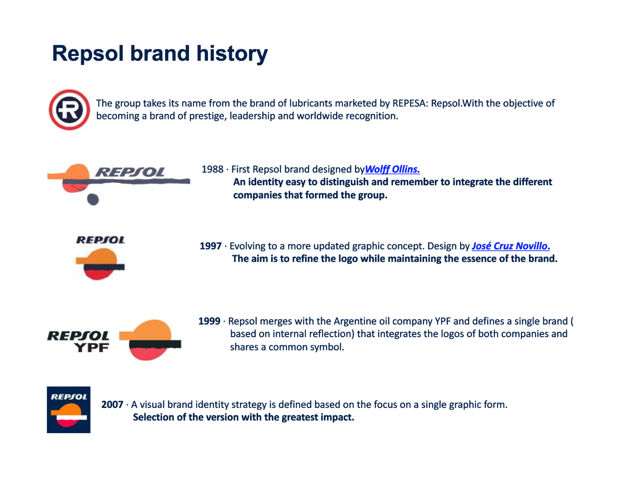
Repsol has much evolved over the years to become what it is today: an energy company operating worldwide and a leader in the sector. Just like its business, Repsol’s identity has adapted and strengthened at each vital step of the way since 1951. Interestingly, lubricants were the start of it all.
The story begins in the 50s when the company, then called REPESA, decided to launch a new range of lubricants called Repsol, with an iconic logo of an “R”, so easily recognizable that it became a favorite of consumers at the time.
While dominating the motorcycle racing world with riders like Ángel Nieto, Repsol became the top brand in Spain, thanks to its innovation and development of specialized products in this sector.
Later in 1987, Repsol consolidated itself as a leading company in the production, transportation, and refining of oil and gas, and with it came a change to its image by Wolf Olins, with the aim of uniting the various activities carried out by the company.
From then until today, the new Repsol logo has had a special significance: it’s composed of a setting sun, a silver band representing the horizon that separates the ocean and the sky, and in the lower half, the reflection of the sun in the ocean.
Ten years later, given the company’s major advances in its commitment to the evolution of technology and energy, Repsol decided that its logo should transmit all of the values and goals that sustain the company: continuous innovation, quality, and specialized products. This led to a complete update to the logo, giving it a shortened horizon and cleaner and more geometric features.
The company continued to grow and in 1999 acquired the Argentinean oil company YPF, which gave it better positioning as a global company. And that was reflected in the fusion of the two logos that maintained graphic elements of both and turned them into a single symbol.
Each step of the way, Repsol continued to meet its objectives and in 2002 inaugurated its research and development center, placing it at the forefront of Europe helping it to attain constant evolution in each of its products and lubricants.
And in 2012, the brand’s image was once again enhanced for the last time to more loyally convey all the Repsol values and its history including its forward-looking approach and commitment: a clear and clean horizon, crisp and soft colors, an image that gives a 3D effect, and finally, tilting of the same logo to the right to give it a sense of movement and to convey Repsol’s commitment with continuous development and progress.

